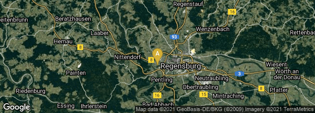

A: Regensburg, Bayern, Germany
The Prüfening dedicatory inscription (Prüfeninger Weiheinschrift), a high medieval inscription created in 1119 in Prüfening Abbey, a former Benedictine monastery, in Regensburg, Germany, was produced by stamping individual carved wooden Roman square capitals into clay, using the typographic principle in which identical pre-formed letters were repeated. This may be the earliest precisely datable application of the typographic principle in Europe.
The inscription, attached to one of the main pillars of the church,
"reports the consecration act of the monastery in honour of St. George, carried out by the two bishops Otto of Bamberg and Hartwig of Regensburg. The inscription plate specifies the year of the act and, by implication, its own date as 1119 (•MCXVIIII•). It was made of baked clay, painted over in an alternating, red white pattern, and is approximately 26 cm wide, 41 cm high and 3 cm thick, with a crack running through its entire breadth. The sunk letterforms are the classical capitalis monumentalis or Roman square capitals. . . .
"The unusual sharpness of the inscription letters has long led epigraphists to believe that they were not carved by hand into the clay. The typographic character of the inscription was recently demonstrated in a systematic examination of the text body by the typesetter and linguist Herbert Brekle. His findings confirm that the text was produced with a printing method similar to that of the Phaistos Disc: The 17-line text was created by pressing individual, pre-formed stamps (probably made of wood) into the soft clay in a way that, for each letter which occurred more than once, the same letter stamp was re-used, thereby producing identical imprints throughout the text. Thus, the essential criterion for typographic text production was met, namely the repeated use of identical types for a single character. In applying this technique, it is not relevant that the Prüfening inscription was made by stamping letters into the clay and not − as later practiced by Gutenberg − by printing on paper, since neither the technical execution nor the print medium define movable type printing, but rather the criterion of type identity:
"The defining criterion which a typographic print has to fulfill is that of the type identity of the various letter forms which make up the printed text. In other words: each letter form which appears in the text has to be shown as a particular instance ('token) of one and the same type which contains a reverse image of the printed letter.
"By projecting the text letters one upon the other (e.g., all 'A's onto one another) at high magnification, the consistent type identity of the dedicatory inscription could be demonstrated beyond doubt. An additional indication that its creator had worked with reusable types is the marked tendency of some letters to tilt to the right or left; in those case the artisan apparently did not succeed in setting up the letter stamps completely parallel to the lateral borderline of the plate. The evidence of the skewed letters, but most importantly the observation that the type token criterion was met throughout the text prove the 'typographic character of the Prüfening dedicatory inscription with certainty.'
"A fragment of another inscription plate found close to the monastery indicates that the Prüfening abbey inscription did not remain an isolated phenomenon, but that at least locally the typographic production method was applied more frequently" (Wikipedia article on Prüfening inscription, accessed 10-31-2012).