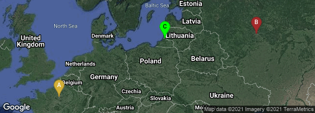
A: Paris, Île-de-France, France, B: Tsentralnyy administrativnyy okrug, Moskva, Russia, C: Klaipėdos apskritis, Lithuania
"Figurative Map of the successive losses in men of the French Army in the Russian campaign 1812–1813.
Drawn up by M. Minard, Inspector General of Bridges and Roads in retirement. Paris, 20 November 1869.
"The numbers of men present are represented by the widths of the colored zones at a rate of one millimeter for every ten-thousand men; they are further written across the zones. The red [now brown] designates the men who enter into Russia, the black those who leave it. —— The information which has served to draw up the map has been extracted from the works of M. M. Thiers, of Segur, of Fezensac, of Chambray, and the unpublished diary of Jacob, pharmacist of the army since October 28th. In order to better judge with the eye the diminution of the army, I have assumed that the troops of prince Jerome and of Marshal Davoush who had been detached at Minsk and Moghilev and have rejoined around Orcha and Vitebsk, had always marched with the army.
"The scale is shown on the center-right, in "lieues communes de France" (common French league) which is 4444 m (2.75 miles).
"The lower portion of the graph is to be read from right to left. It shows the temperature on the army's return from Russia, in degrees below freezing on the Réaumur scale. (Multiply Réaumur temperatures by 1¼ to get Celsius, e.g. −30 °R = −37.5 °C) At Smolensk, the temperature was −21° Réaumur on 14 November" (Wikipedia)
On November 20, 1869 French civil engineer Charles Joseph Minard published in Paris Carte figurative des pertes successives en hommes de l'Armée Française dans la campagne de Russie 1812-1813. This was a a flow map on Napoleon's disastrous Russian campaign of 1812 in which he marched his army of 500,000 men from the Neman River to Moscow.
"The graph displays several variables in a single two-dimensional image:
"• the army's location and direction, showing where units split off and rejoined
"• the declining size of the army (note e.g. the crossing of the Berezina river on the retreat)
"• the low temperatures during the retreat.
"Étienne-Jules Marey first called notice to this dramatic depiction of the terrible fate of Napoleon's army in the Russian campaign, saying it "defies the pen of the historian in its brutal eloquence". Edward Tufte says it 'may well be the best statistical graphic ever drawn' and uses it as a prime example in The Visual Display of Quantitative Information" (Wikipedia article on Charles Joseph Minard, accessed 01-16-2011).
The chart is a lithograph 62 x 30 cm.
♦ An essay on Minard's historical sources for the chart, and a different reproduction pf the chart, was available at http://www.edwardtufte.com/tufte/minard in January 2011.
♦ The bibliographer of Minard's statistical graphics, Michael Friendly, posted several very interesting graphic variations on Minard's chart as Re-Visions of Minard. "I use 're-vision' in the sense of both 'to revise' and 'to see again', possibly from a new perspective." This was also available in January 2011.